Joined spatial aggregate
Comparing mobility with handset types
This worked example demonstrates using joined spatial aggregate queries in FlowKit. A joined spatial aggregate query calculates a metric for each subscriber, and joins the metric values to subscribers' locations before aggregating the metric by region.
Suppose we want to investigate whether there is a link between subscribers' mobility and their handset types. We can calculate two joined spatial aggregates:
- Average radius of gyration per region. Radius of gyration is a measure of the spread of a subscriber's event locations - a subscriber with a large radius of gyration will have events spread over a larger area (for example, somebody who commutes over a long distance or regularly travels to regions away from their home).
- Distribution of handset types (basic/feature/smartphone) per region. Once we have the results of these queries, we can investigate whether there is any correlation between the metrics.
The Jupyter notebook for this worked example can be downloaded here, or can be run using the quick start setup.
Load FlowClient and connect to FlowAPI
We start by importing FlowClient. We also import pandas, geopandas and matplotlib, which we will use for performing further analysis and visualisation of the outputs from FlowKit.
import os

import pandas as pd
import geopandas as gpd
import matplotlib.pyplot as plt

import flowclient as fc

%matplotlib inline
We must next generate a FlowAPI access token using FlowAuth. If you are running this notebook using the quick start setup, generating a token requires the following steps:
- Visit the FlowAuth login page at http://localhost:9091.
- Log in with username
TEST_USERand passwordDUMMY_PASSWORD. - Under "My Servers", select
TEST_SERVER. - Click the
+button to create a new token. - Give the new token a name, and click
SAVE. - Copy the token string using the
COPYbutton. - Paste the token in this notebook as
TOKEN.
The steps are the same in a production setup, but the FlowAuth URL, login details and server name will differ.
Once we have a token, we can start a connection to the FlowAPI system. If you are connecting to FlowAPI over https (recommended) and the system administrator has provided you with an SSL certificate file, you should provide the path to this file as the ssl_certificate argument to flowclient.connect() (in this example, you can set the path in the environment variable SSL_CERTIFICATE_FILE). If you are connecting over http, this argument is not required.
conn = fc.connect(
    url=os.getenv("FLOWAPI_URL", "http://localhost:9090"),
    token=TOKEN,
    ssl_certificate=os.getenv("SSL_CERTIFICATE_FILE"),
)
Specify FlowKit queries
Next, we create query specifications for the FlowKit queries we will run.
Locations
Joined spatial aggregate queries join a per-subscriber metric to the subscribers' locations, so we need a query that assigns a single location to each subscriber. Here we use a modal location query to estimate subscribers' home locations over the period of interest (first seven days of 2016), at administrative level 3.
date_range = ("2016-01-01", "2016-01-08")
modal_loc = fc.modal_location_from_dates_spec(
    start_date=date_range[0],
    end_date=date_range[1],
    aggregation_unit="admin3",
    method="last",
)
Radius of gyration
We create a joined spatial aggregate query specification to calculate the average radius of gyration per region, using locations from the modal location query above.
rog_query = fc.radius_of_gyration_spec(
    start_date=date_range[0],
    end_date=date_range[1],
)

jsa_rog_query = fc.aggregates.joined_spatial_aggregate_spec(
    locations=modal_loc,
    metric=rog_query,
    method="avg",
)
Handset type
Finally, we specify a second joined spatial aggregate query, this time using a handset metric with the "hnd_type" (handset type) characteristic. The handset query will return a categorical variable (handset type is one of "Basic", "Feature" or "Smart"), so we must choose the "distr" method for the joined spatial aggregate, to get the distribution of handset types per region.
handset_query = fc.handset_spec(
    start_date=date_range[0],
    end_date=date_range[1],
    characteristic="hnd_type",
    method="most-common",
)

jsa_handset_query = fc.aggregates.joined_spatial_aggregate_spec(
    locations=modal_loc,
    metric=handset_query,
    method="distr",
)
Radius of gyration results
Now that we have a FlowClient connection and we have specified our queries, we can run the queries and get the results using FlowClient's get_result function. First, we get the results of the radius of gyration query.
rog_results = fc.get_result(connection=conn, query_spec=jsa_rog_query)
rog_results.head()
| pcod | value | |
|---|---|---|
| 0 | NPL.4.1.1_1 | 81.136 |
| 1 | NPL.1.3.3_1 | 45.258 |
| 2 | NPL.1.1.3_1 | 46.6002 |
| 3 | NPL.3.1.4_1 | 104.777 |
| 4 | NPL.1.2.1_1 | 52.684 |
The resulting dataframe has two columns: pcod (the P-code of each region) and value (the average radius of gyration, in km). Later, we will want to join with other results for the same regions, so let's set the pcod column as the index. We also rename the value column, to give it the more descriptive name radius_of_gyration.
rog_results = rog_results.rename(columns={"value": "radius_of_gyration"}).set_index(
    "pcod"
)
rog_results.head()
pcod |
radius_of_gyration |
|---|---|
| NPL.4.1.1_1 | 81.136 |
| NPL.1.3.3_1 | 45.258 |
| NPL.1.1.3_1 | 46.6002 |
| NPL.3.1.4_1 | 104.777 |
| NPL.1.2.1_1 | 52.684 |
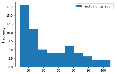
We can get a summary of the data using the dataframe's describe method, and quickly see the distribution of values using plot.hist.
rog_results.describe()
| radius_of_gyration | |
|---|---|
| count | 59 |
| mean | 63.3755 |
| std | 17.0415 |
| min | 44.2073 |
| 25% | 48.4216 |
| 50% | 60.1816 |
| 75% | 76.1945 |
| max | 104.777 |
rog_results.plot.hist();
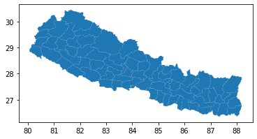
To see the spatial distribution of radius of gyration, we need the geographic boundaries of the administrative regions. We can get these as GeoJSON using the FlowClient get_geography function, and load into a GeoPandas GeoDataFrame using the GeoDataFrame.from_features method.
geog = gpd.GeoDataFrame.from_features(
    fc.get_geography(connection=conn, aggregation_unit="admin3")
).set_index("pcod")
The plot method is a quick way to see the regions described by this GeoDataFrame.
geog.plot();
Now we can join the geography data to the radius of gyration results, and create a choropleth map by plotting again using the radius_of_gyration column to colour the regions.
(Note: the order in which we join here is important - rog_results.join(geog) would produce a pandas DataFrame, not a geopandas GeoDataFrame, and the plot method would produce a different plot).
geog.join(rog_results).plot(column="radius_of_gyration", legend=True);
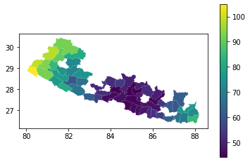
There are gaps in this choropleth map. Looking at the content of the 'radius_of_gyration' column in the joined dataframe, we can see why:
geog.join(rog_results)[["radius_of_gyration"]].head()
pcod |
radius_of_gyration |
|---|---|
| NPL.1.1.1_1 | 45.3721 |
| NPL.1.1.2_1 | 44.3328 |
| NPL.1.1.5_1 | 47.3163 |
| NPL.1.1.3_1 | 46.6002 |
| NPL.1.1.4_1 | nan |
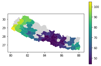
There are some regions for which we have no radius_of_gyration data, because these regions contained fewer than 15 subscribers so FlowKit redacted the results to preserve privacy. We can drop these rows using the dropna method. So that we can still see the shapes of the regions with no data, let's plot the geog data as a light grey background behind our choropleth map.
background = geog.plot(color="lightgrey")
geog.join(rog_results).dropna().plot(
    ax=background, column="radius_of_gyration", legend=True
);
Handset type results
Next we get the results of our handset-type query.
handset_results = fc.get_result(connection=conn, query_spec=jsa_handset_query)
handset_results.head()
| pcod | metric | key | value | |
|---|---|---|---|---|
| 0 | NPL.1.1.1_1 | value | Basic | 0.311364 |
| 1 | NPL.1.1.1_1 | value | Feature | 0.338636 |
| 2 | NPL.1.1.1_1 | value | Smart | 0.35 |
| 3 | NPL.1.1.2_1 | value | Feature | 0.373932 |
| 4 | NPL.1.1.2_1 | value | Basic | 0.324786 |
This dataframe has four columns: pcod (the P-code, as above), metric, key (the handset type) and value (the proportion of subscribers in that region who have that handset type). The metric column just contains the value "value" in every row, which is not useful to us, so let's drop it. We'll also rename the key and value columns to handset_type and proportion, respectively.
This time we have three rows per P-code, one for each handset type, so let's set a MultiIndex using the pcod and handset_type columns.
handset_results = (
    handset_results.rename(columns={"key": "handset_type", "value": "proportion"})
    .drop(columns="metric")
    .set_index(["pcod", "handset_type"])
)
handset_results.head()
pcod, handset_type |
proportion |
|---|---|
| ('NPL.1.1.1_1', 'Basic') | 0.311364 |
| ('NPL.1.1.1_1', 'Feature') | 0.338636 |
| ('NPL.1.1.1_1', 'Smart') | 0.35 |
| ('NPL.1.1.2_1', 'Feature') | 0.373932 |
| ('NPL.1.1.2_1', 'Basic') | 0.324786 |
We can get a summary of the data using the describe method, but let's first group by handset_type to get a summary per handset type.
handset_results.groupby("handset_type").describe()
handset_type |
proportion count |
proportion mean |
proportion std |
proportion min |
proportion 25% |
proportion 50% |
proportion 75% |
proportion max |
|---|---|---|---|---|---|---|---|---|
| Basic | 59 | 0.329227 | 0.0242045 | 0.256272 | 0.319009 | 0.329078 | 0.342217 | 0.394286 |
| Feature | 59 | 0.340488 | 0.0212247 | 0.284615 | 0.331467 | 0.338462 | 0.353487 | 0.390728 |
| Smart | 59 | 0.330285 | 0.021755 | 0.291339 | 0.31283 | 0.331019 | 0.343481 | 0.382979 |
To plot histograms for the three handset types, it would be convenient if the proportion data for each handset type were in separate columns. Since we set a hierarchical index on the handset_results dataframe, we can use the unstack method to unpack the innermost level of the index (handset_type, in this case) into separate columns.
handset_results.unstack().head()
handset_type pcod |
proportion Basic |
proportion Feature |
proportion Smart |
|---|---|---|---|
| NPL.1.1.1_1 | 0.311364 | 0.338636 | 0.35 |
| NPL.1.1.2_1 | 0.324786 | 0.373932 | 0.301282 |
| NPL.1.1.3_1 | 0.324331 | 0.337482 | 0.338187 |
| NPL.1.1.5_1 | 0.343415 | 0.332683 | 0.323902 |
| NPL.1.1.6_1 | 0.349057 | 0.307278 | 0.343666 |
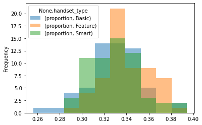
This produces a dataframe with a single-level index, and a MultiIndex as column headers. Now the plot.hist method plots all three histograms on the same axes. We set alpha=0.5 to make them slightly transparent. In this dataset we can see that there is little difference between the distributions of the different handset types - the proportions of all handset types are approximately equal in all regions.
handset_results.unstack().plot.hist(alpha=0.5);
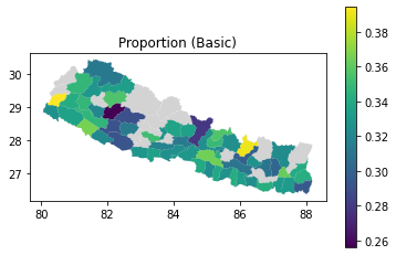
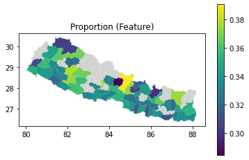
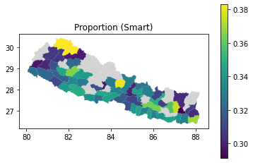
As with the radius of gyration results, we can also join to the geography data and plot choropleth maps of the handset type distributions. We use the query method to select the subset of rows for a given handset type.
handset_results_with_geo = geog.join(handset_results).dropna()

for htype in ["Basic", "Feature", "Smart"]:
    ax = geog.plot(color="lightgrey")
    ax.set_title(f"Proportion ({htype})")
    handset_results_with_geo.query(f"handset_type == '{htype}'").plot(
        ax=ax, column="proportion", legend=True
    );
combined = rog_results.join(handset_results.unstack())
combined.head()
pcod |
radius_of_gyration |
('proportion', 'Basic') |
('proportion', 'Feature') |
('proportion', 'Smart') |
|---|---|---|---|---|
| NPL.4.1.1_1 | 81.136 | 0.320493 | 0.338983 | 0.340524 |
| NPL.1.3.3_1 | 45.258 | 0.364428 | 0.325871 | 0.309701 |
| NPL.1.1.3_1 | 46.6002 | 0.324331 | 0.337482 | 0.338187 |
| NPL.3.1.4_1 | 104.777 | 0.324818 | 0.350365 | 0.324818 |
| NPL.1.2.1_1 | 52.684 | 0.332849 | 0.335029 | 0.332122 |
Correlation
The corr method provides a quick way to calculate the correlation between all pairs of columns. We're interested in the correlation between radius of gyration and each of the proportion columns. From these results, there appears to be no significant correlation between handset type and radius of gyration.
combined.corr()
| radius_of_gyration | ('proportion', 'Basic') | ('proportion', 'Feature') | ('proportion', 'Smart') | |
|---|---|---|---|---|
| radius_of_gyration | 1 | 0.101425 | 0.0741593 | -0.185196 |
| ('proportion', 'Basic') | 0.101425 | 1 | -0.548013 | -0.577939 |
| ('proportion', 'Feature') | 0.0741593 | -0.548013 | 1 | -0.365908 |
| ('proportion', 'Smart') | -0.185196 | -0.577939 | -0.365908 | 1 |
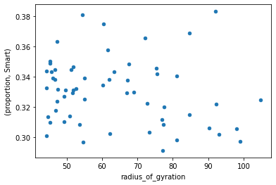
Scatter plot
To see whether there is any relationship that's not apparent from the correlation, let's make a scatter plot of radius of gyration against proportion of subscribers who use a smartphone.
combined.plot.scatter(x="radius_of_gyration", y=("proportion", "Smart"));
We can use matplotlib to plot radius of gyration against proportion for each of the handset types on the same plot.
fig, ax = plt.subplots()

for htype in ["Basic", "Feature", "Smart"]:
    ax.scatter(
        combined["radius_of_gyration"],
        combined[("proportion", htype)],
        label=htype,
    )
ax.set_xlabel("Radius of gyration (km)")
ax.set_ylabel("Handset type proportion")
ax.legend();
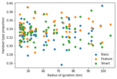
There is no obvious pattern visible in these plots, so for this test dataset we have found no relationship between subscribers' handset types and their radius of gyration.